Call to arms
Call to Arms was a mobile strategy game developed in-house at GREE, a global entertainment company based in Japan. Based on the mid-core tone of the game, as well as the overall look, my team and I developed a cheeky and fun personality for the brand.
In my role, I trained my team to be scrappy yet creative since, user-acquisition required intensive testing with multiple variants. Due to fast production schedules it was necessary, at launch, for my team to repurpose available assets from the product team, to use for marketing creative.
Below shows a quick glance at how we worked with limited resources that translated into a range of mobile creatives.

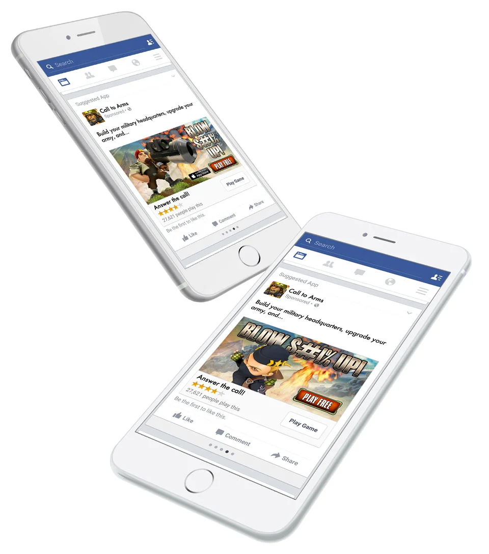
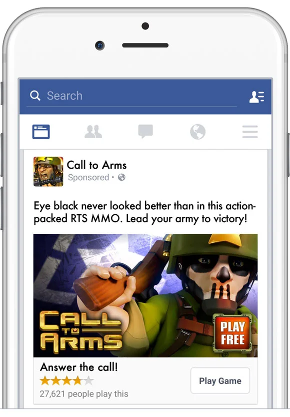
As mentioned above, my team and I had to brainstorm ways to repurpose existing, individual character assets to create unique and fun promotional pieces. For the image at the top of this page, I used three separate assets that, after looking at from a different perspective, could be combined as a tight grouping.
The concept came from the idea of playing off of phrases such as, “To the victor go the spoils!” or, “Ladies love the uniform!” With several of those phrases in mind, and some Photoshop magic, we were able to deliver the image of the soldier with his arms around the two nurses. Below is how you would’ve seen it on Facebook.

app store optimization (aso)
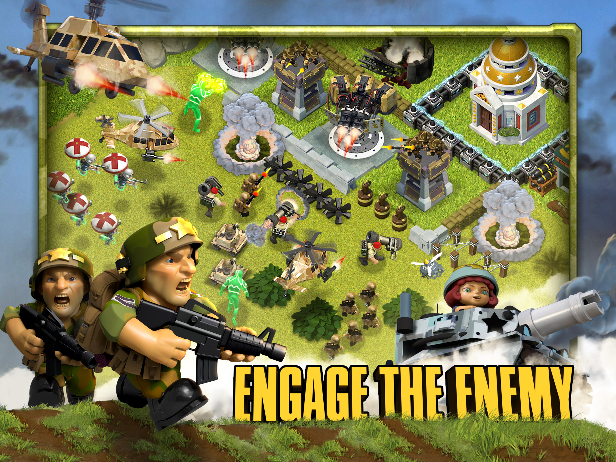
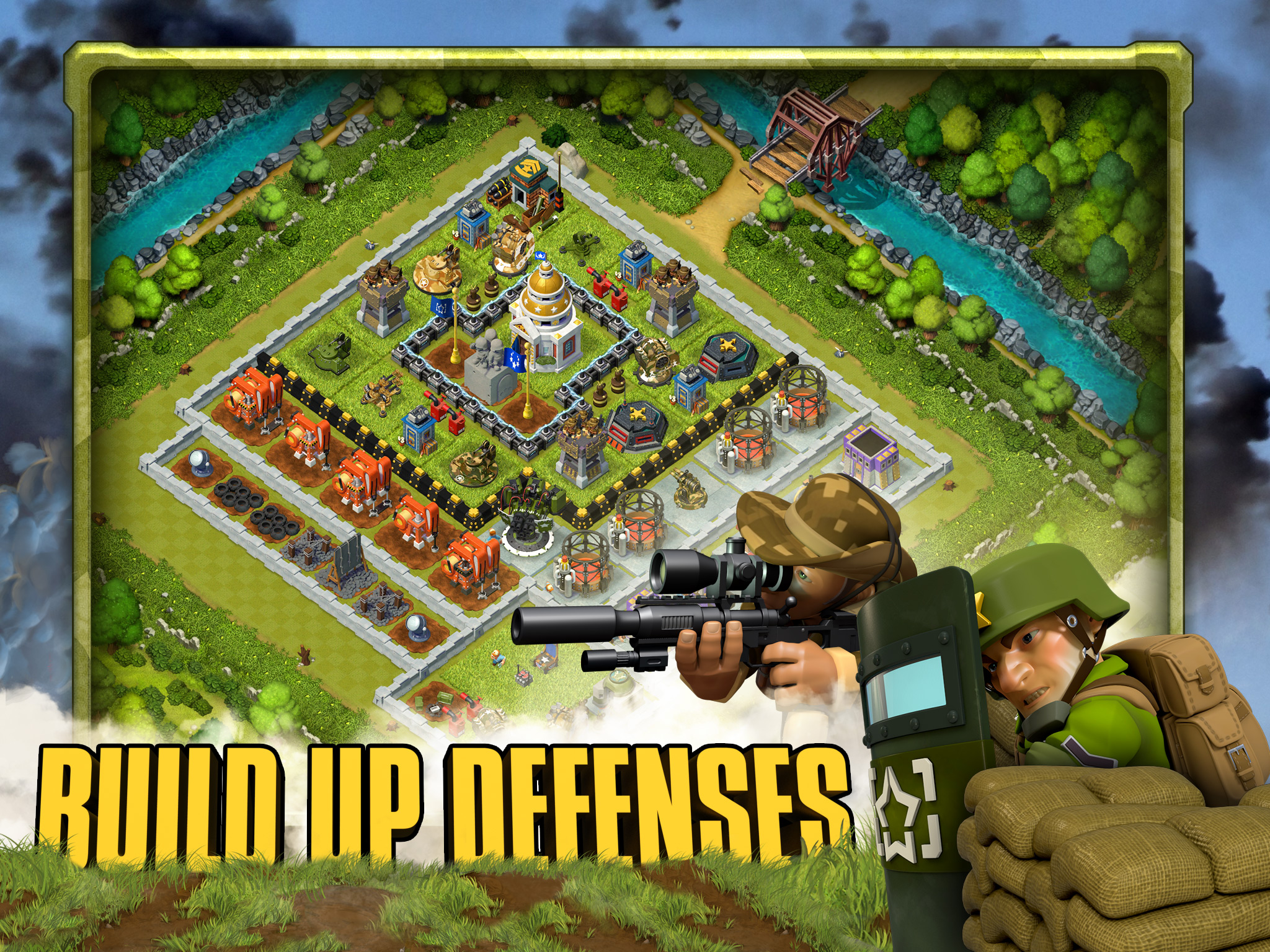
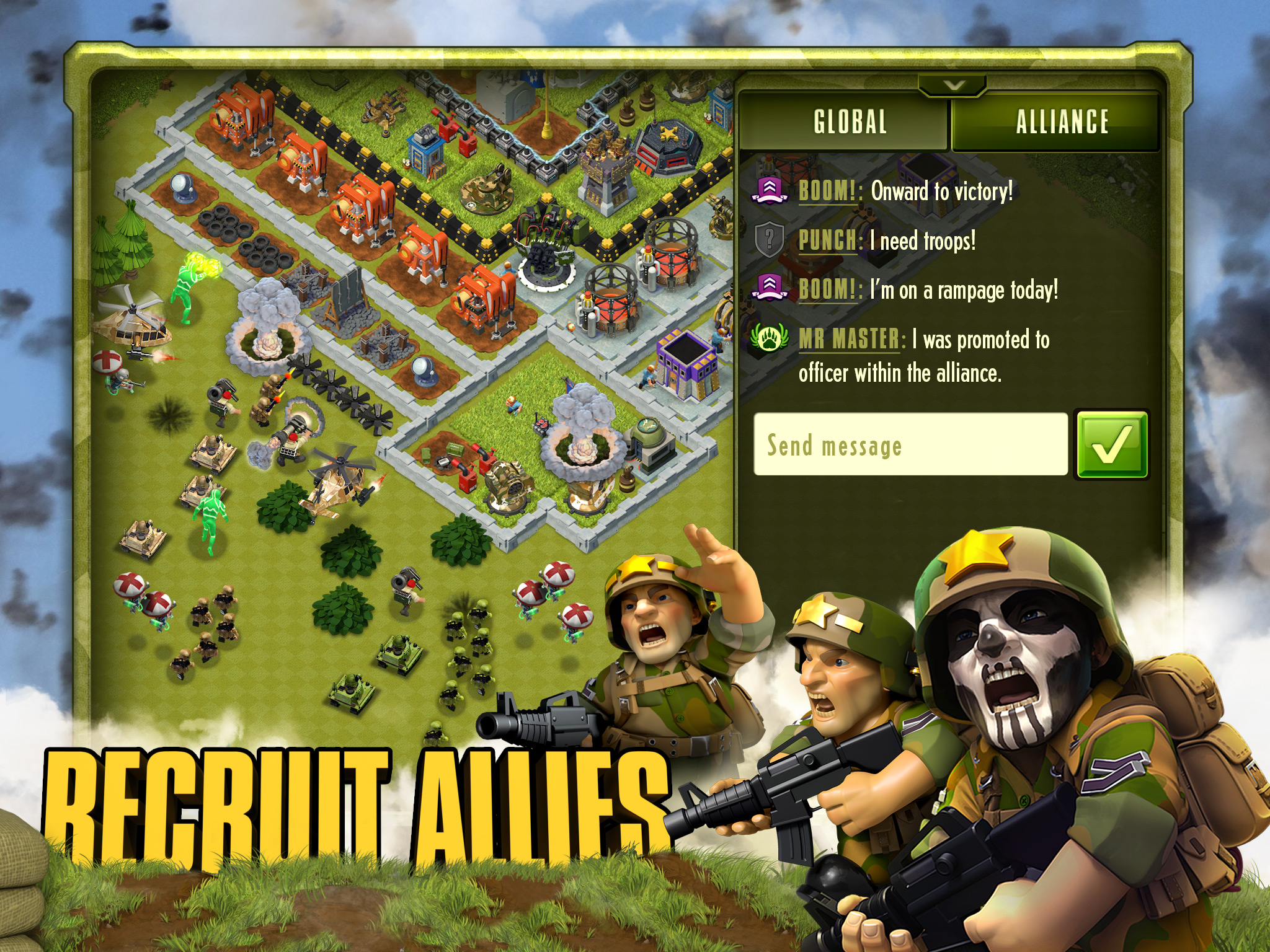
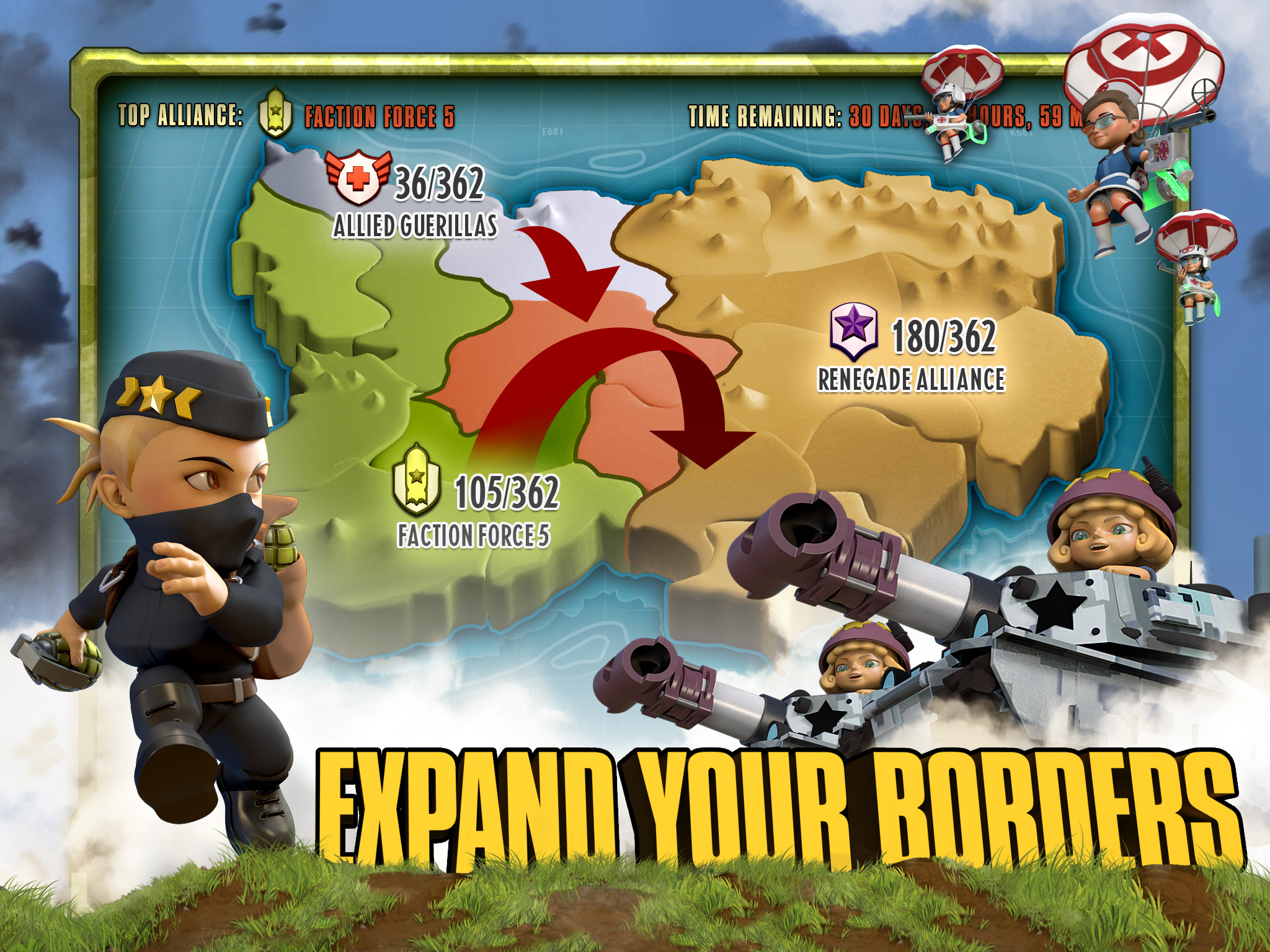
A similar yet much more intensive approach is taken with building out screenshots. The foreground elements were all masked, composed, and color adjusted with the addition of creating in-game screenshots with the desired composition of buildings, units, and action. Each element was placed piece-by-piece from separate assets. The frame containing the in-game screenshots was designed to match the in-game UI and tie everything together. The entire set was designed to be one continuous panoramic story that defined the core pillars of the game.
Multiply that process by the number of iterations tested, in this case about a half dozen, and you get an idea of the level of effort put into testing and optimizing to get our best-performing set of assets.
Marketing & user-acquisition
While performance marketing is all about variants and testing, I wanted to ensure that all assets still reflected our brand personality. A huge part of my role involved partnering with the Studio Art team to develop an efficient process for asset requests. This allowed us to acquire action-oriented and/or unique poses that we could use to create engaging marketing assets based on key metrics in our tests.
Social Media
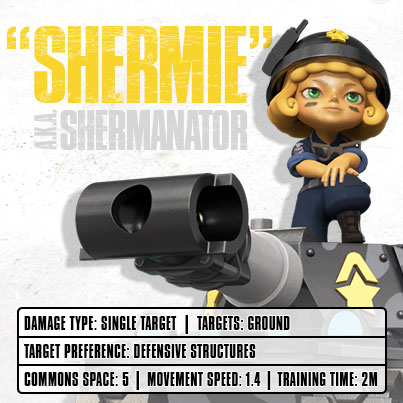
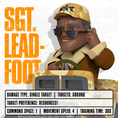
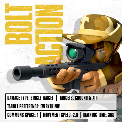
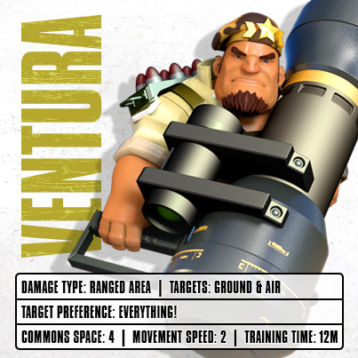
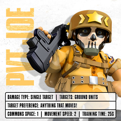
For our social media content, we kept with the same light-hearted tone and personality. The community team wanted to provide players with facts, tips & tricks, and more general information about the game to drive retention. Below are examples of such content in the form of character cards.