PROJECT
I was tasked to rebrand a mobile game to stand out in a crowded and competitive genre heading out of beta into our world-wide launch. This required us to evaluate our competition to figure out how to visually separate ourselves while staying true to the Brand.
PHASE 1
identify the problem
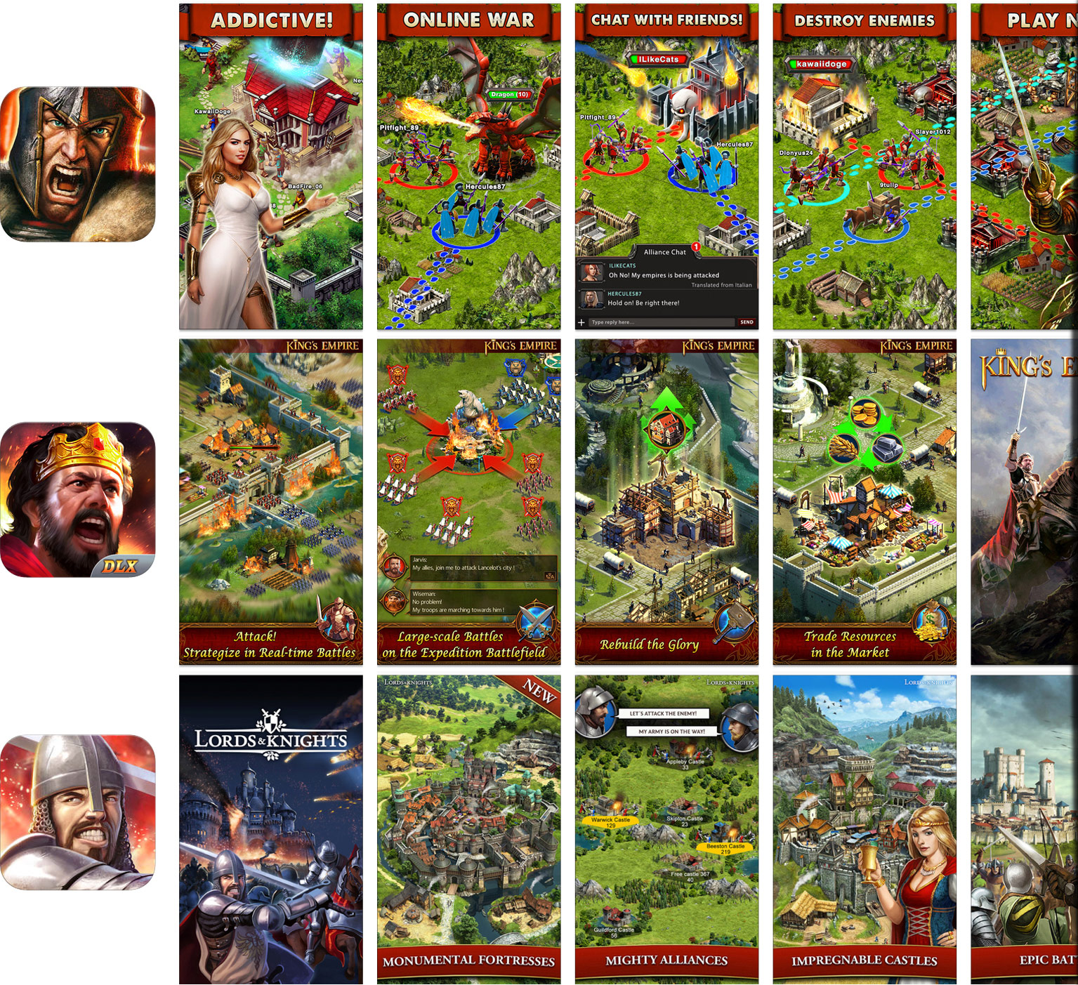
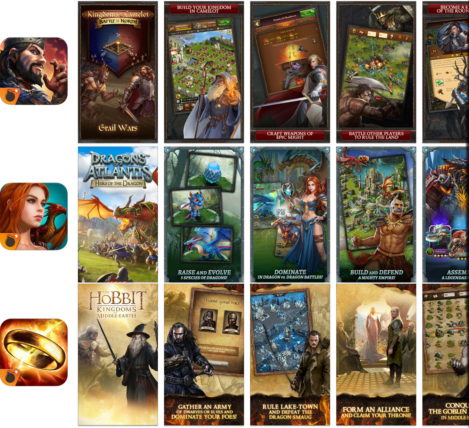
During our marketing beta tests, we noticed that Shadowland's clickthrough and conversation rates were performing below benchmark. After conducting a deep dive against other competitors' visuals in the app store, it became apparent that all of the games in the Fantasy MMO genre had very similar earthy palettes, characters, and landscapes. It was very clear after my research that we had to re-brand our marketing assets to differentiate among the rest.
UNFORTUNATELY...
Our beta assets looked very similar to our competitors.

PHASE 2
deliberate & revise
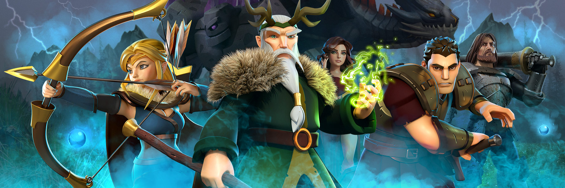
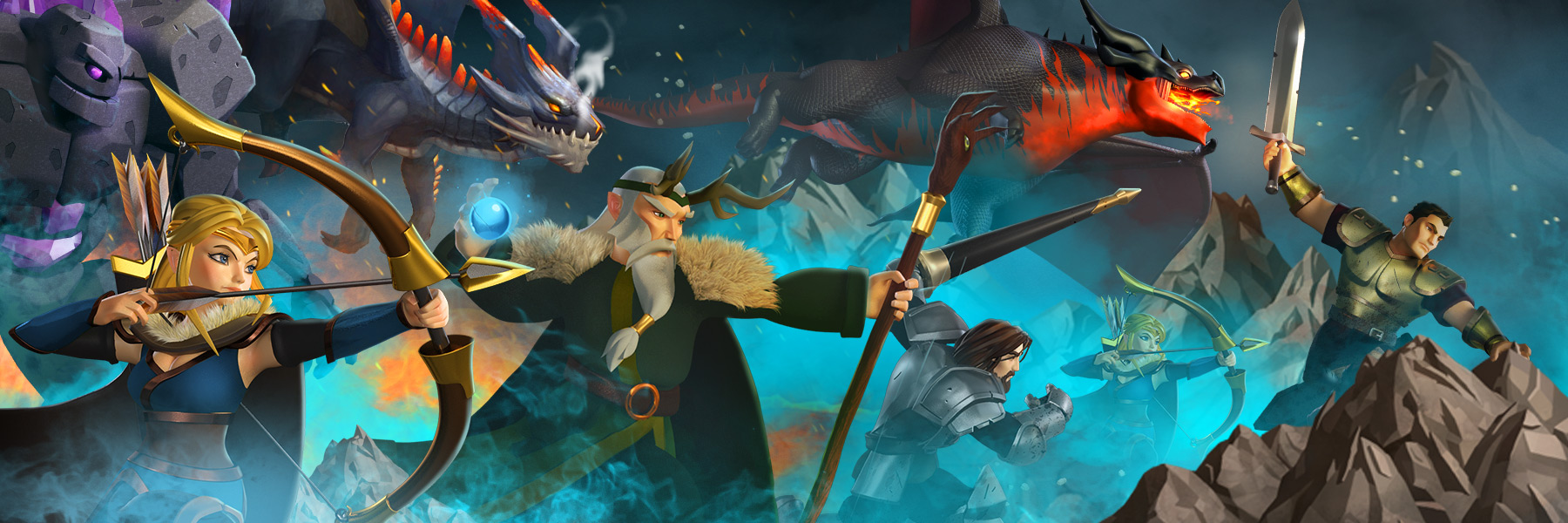
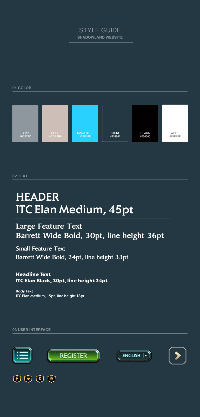
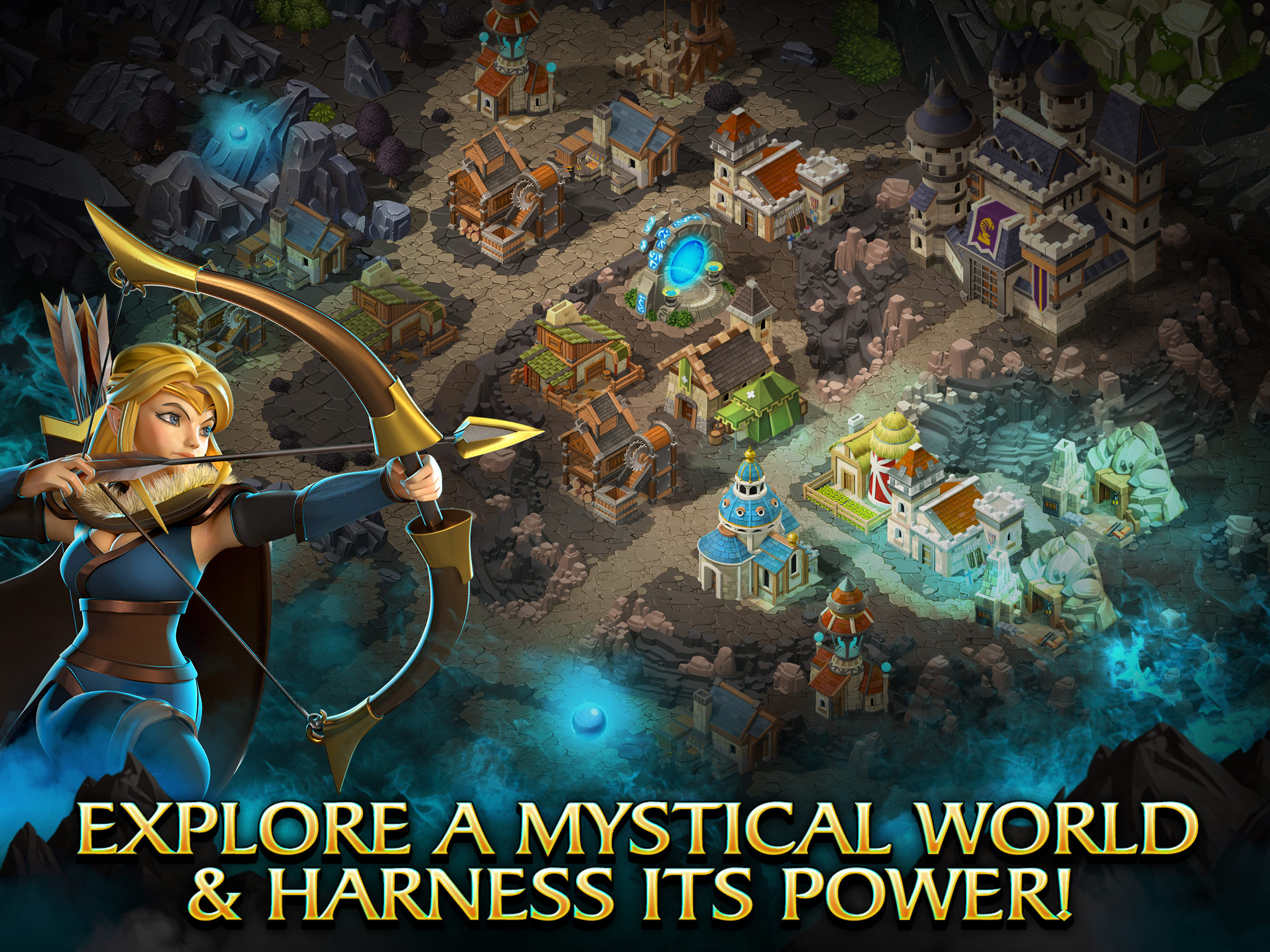
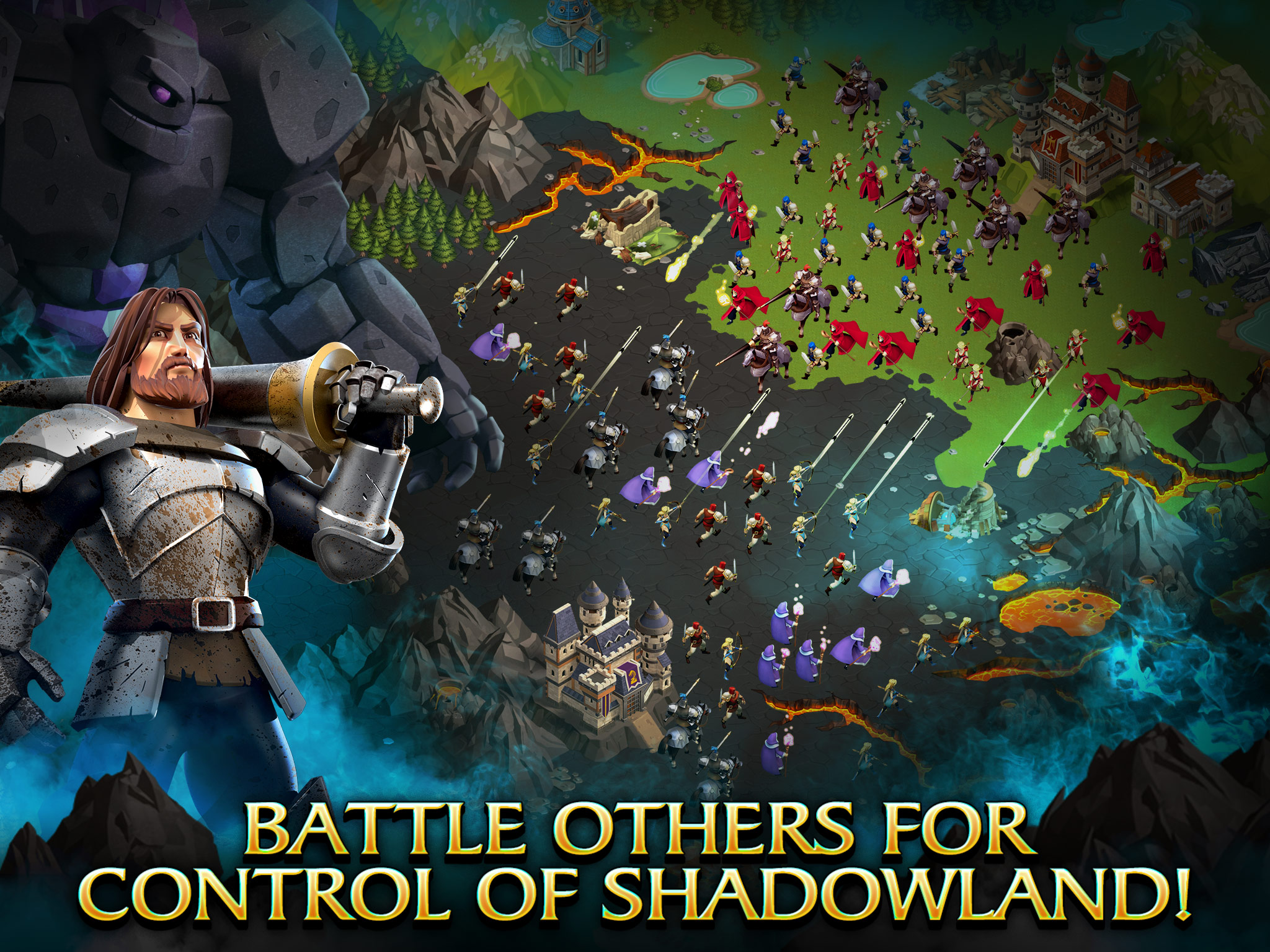
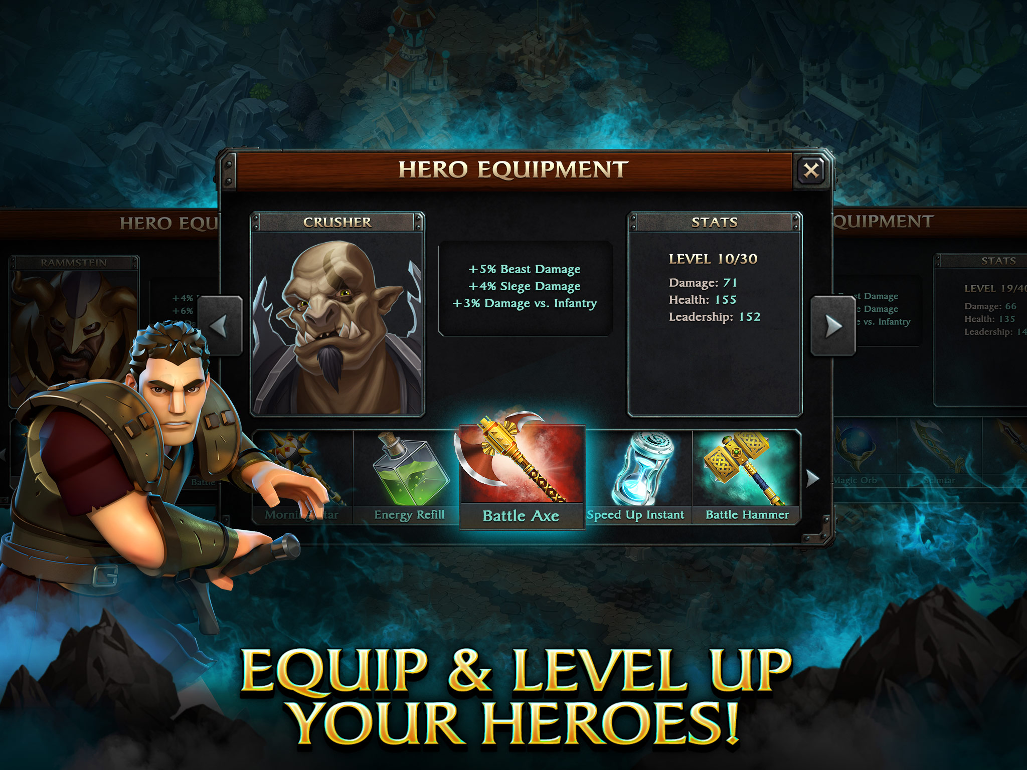
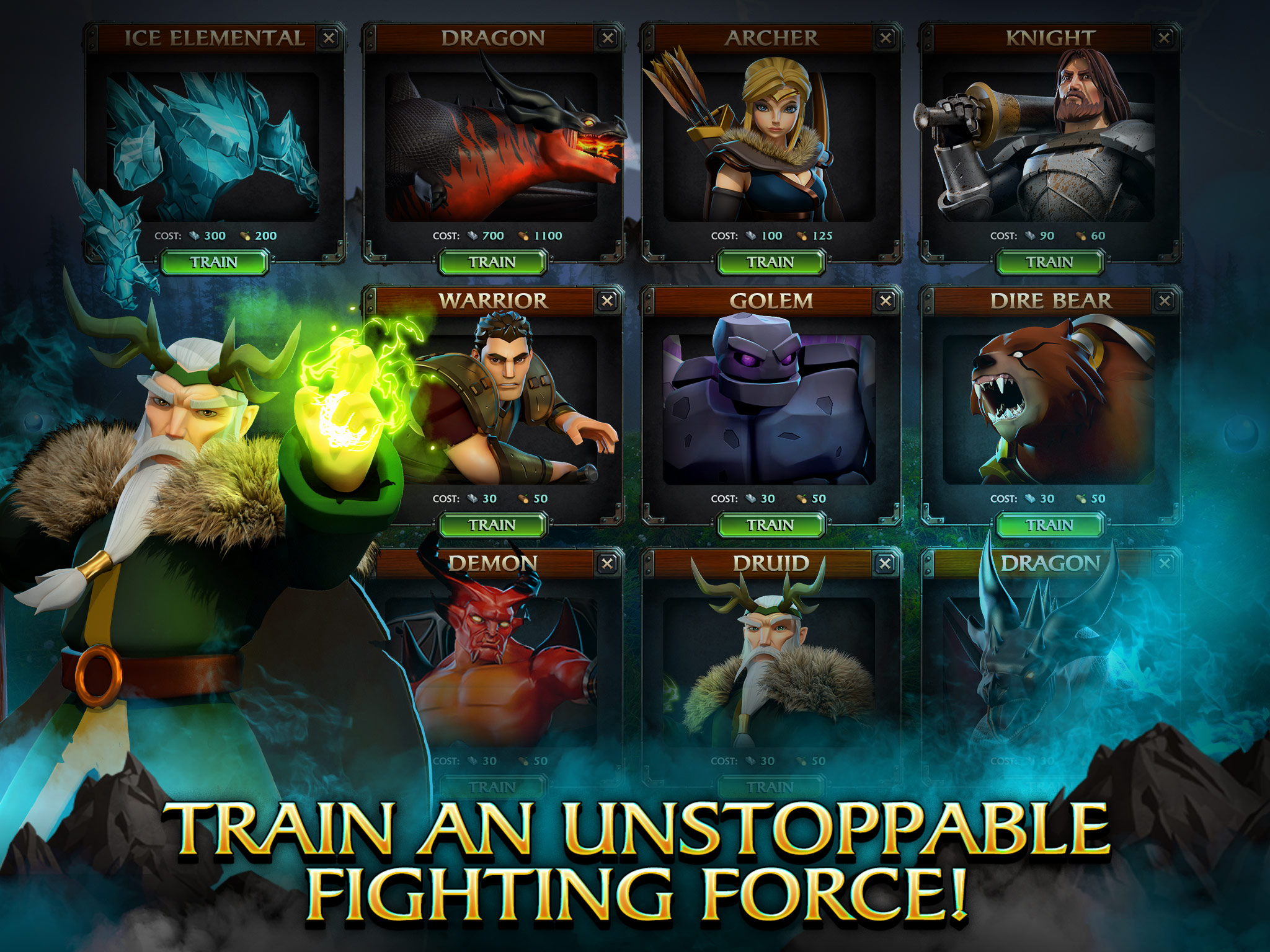
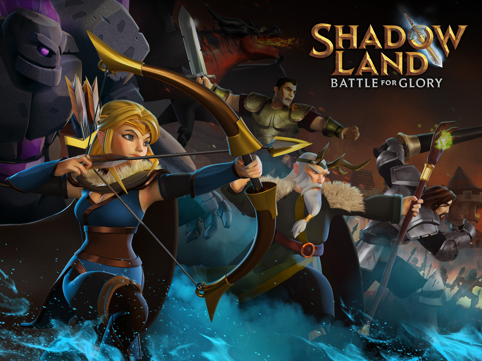
After identifying the problem, we set to reimagine our visuals around the core brand promise of intrigue. A key part of the game's narrative was set around a mysterious element called "Mana", which were magical blue orbs that players sought to collect for rare resources. With an impeding darkness that was overtaking the land, players must harness the power of Mana to strengthen and build their kingdom. With these two elements firmly rooted in the story behind the game, I led the team in the revised direction of contrasting the bright blues of the Mana with the dark and mysterious backdrop of the Shadowlands.
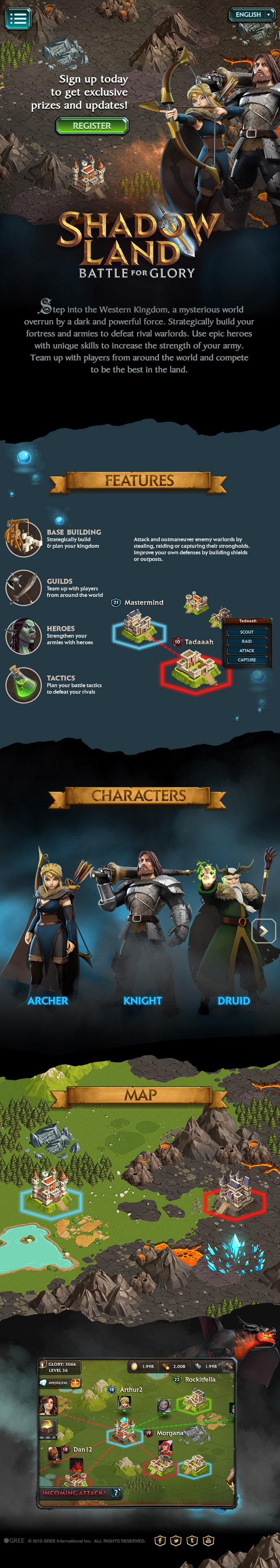
APP STORE REFRESH (ASO)
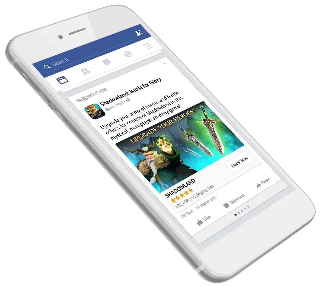
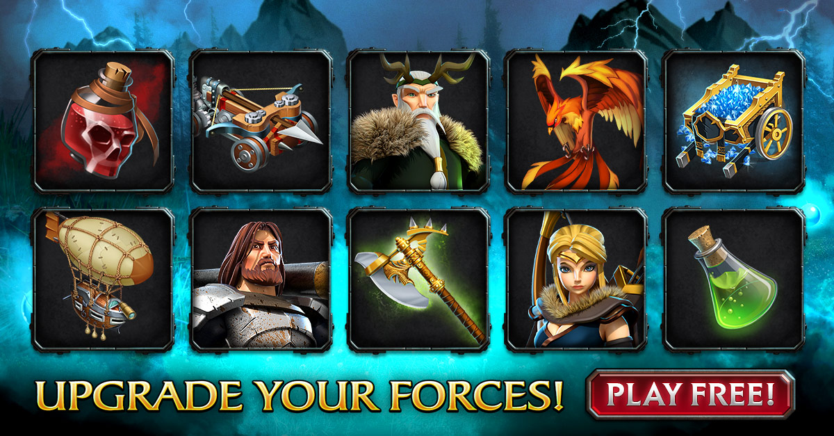
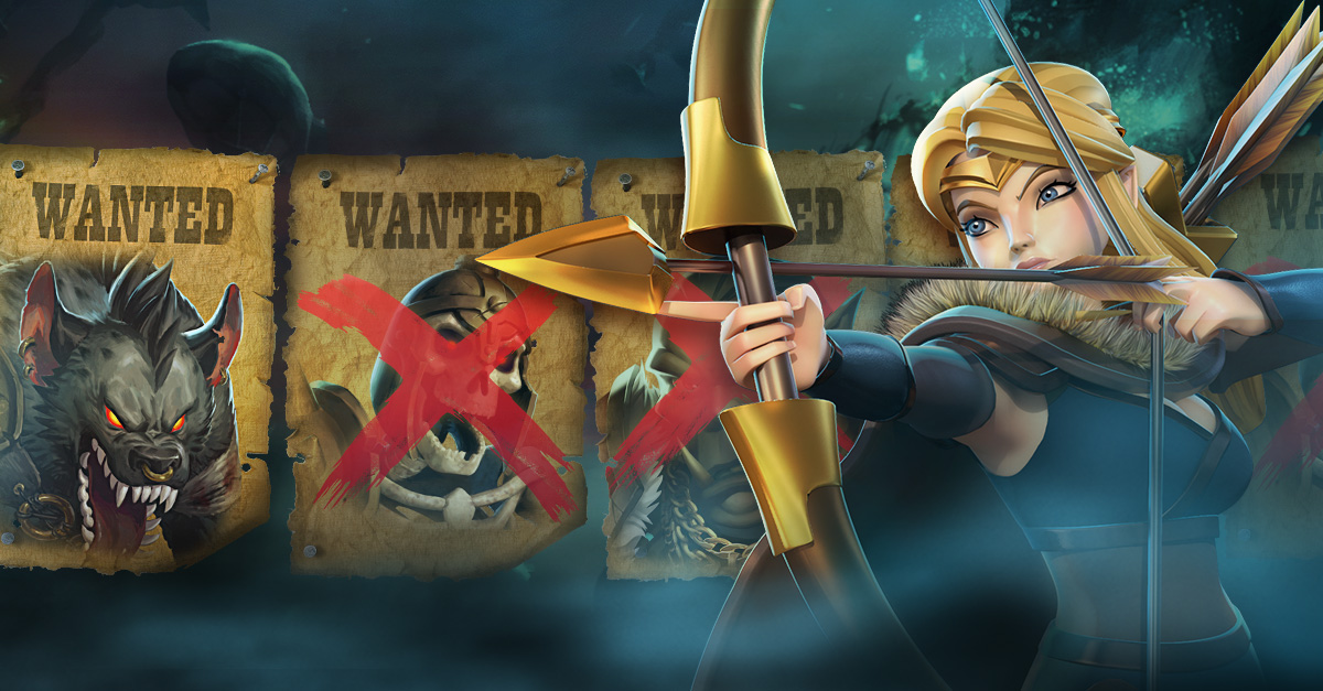
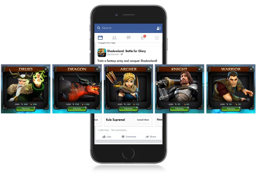
MARKETING USER ACQUISITION REFRESH

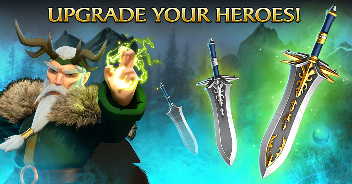
RE-IMAGINED KEY ART