

PROJECT
Create a logo for a gaming studio called Infected Heroes Games. It needed to be trendy and cool with a comic book, superhero vibe - something that would feel right on a business card for a gaming company.
PHASE 1
Exploration & Sketches

PHASE 2
CONCEPT DEVELOPMENT

CONCEPT 1
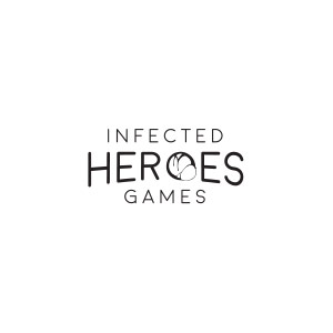
The idea for this concept was to convey the idea of the name in a graphical way. Here, the logotype is displayed with an emphasis on "heroes" and a subtle arch along the bottom to give it a sense of presence and impact. The "o" in this case is a mutated cell with a dividing nucleus to incorporate the infected aspect of the name.

CONCEPT 2
This concept was born from the idea of creating a unique symbol from the first letter of each word. The "I", "H", and "G" are subtly hidden and used to form the shape of a shield. The "H" is fairly obvious in the negative space and the "G" sits along the left side. The "I" is created from the intersection of the "H" and "G".
CONCEPT 3
Taking cues from concepts one and two, I combined the ideas of a disease spreading with the idea of a graphic symbol. In this case, the idea was to use an infected DNA helix as an alternative way of showing the infection on a biological level. The idea being that superheroes rise from mutated or evolved cells.
PHASE 3
FEEDBACK & ITERATION
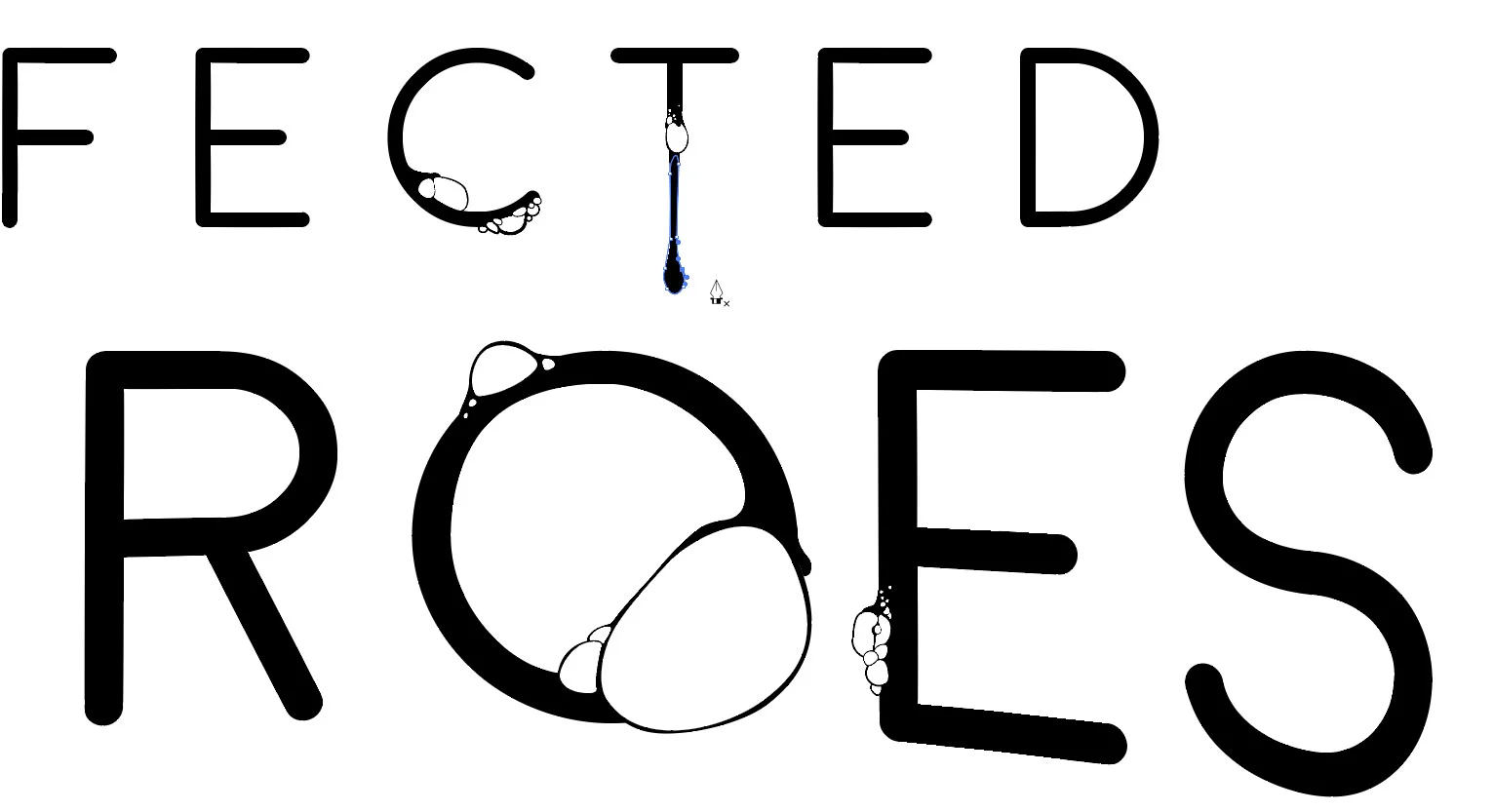
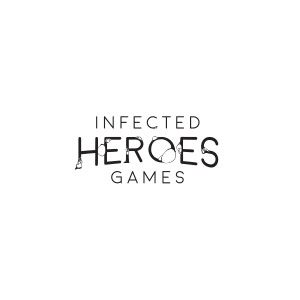
In this phase of the logo design, we moved forward with iterations of Concepts 1 and 3. We also explored a 4th concept which was a mashup of the heroic typographic layout with the infectious boils. Concept 2 was eliminated because, although it was a nice idea, the team felt that the other two better represented the trendy comic book vibe that we wanted to achieve.


PHASE 4
FINAL
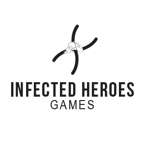
In the end, we settled on a version of the Concept of the mutating cell. Although, I liked the concept with the lesions/boils a bit more, some of the other stakeholders felt it could be a bit off-putting to some audiences. I could see their point, and some of the concerns surrounding it, and thought the concept we settled on would be a good compromise.
